
WHAT MY DOG TAUGHT ME ABOUT WEBSITE DESIGN
Rebecca shares what her dog Aspen taught her about website design…
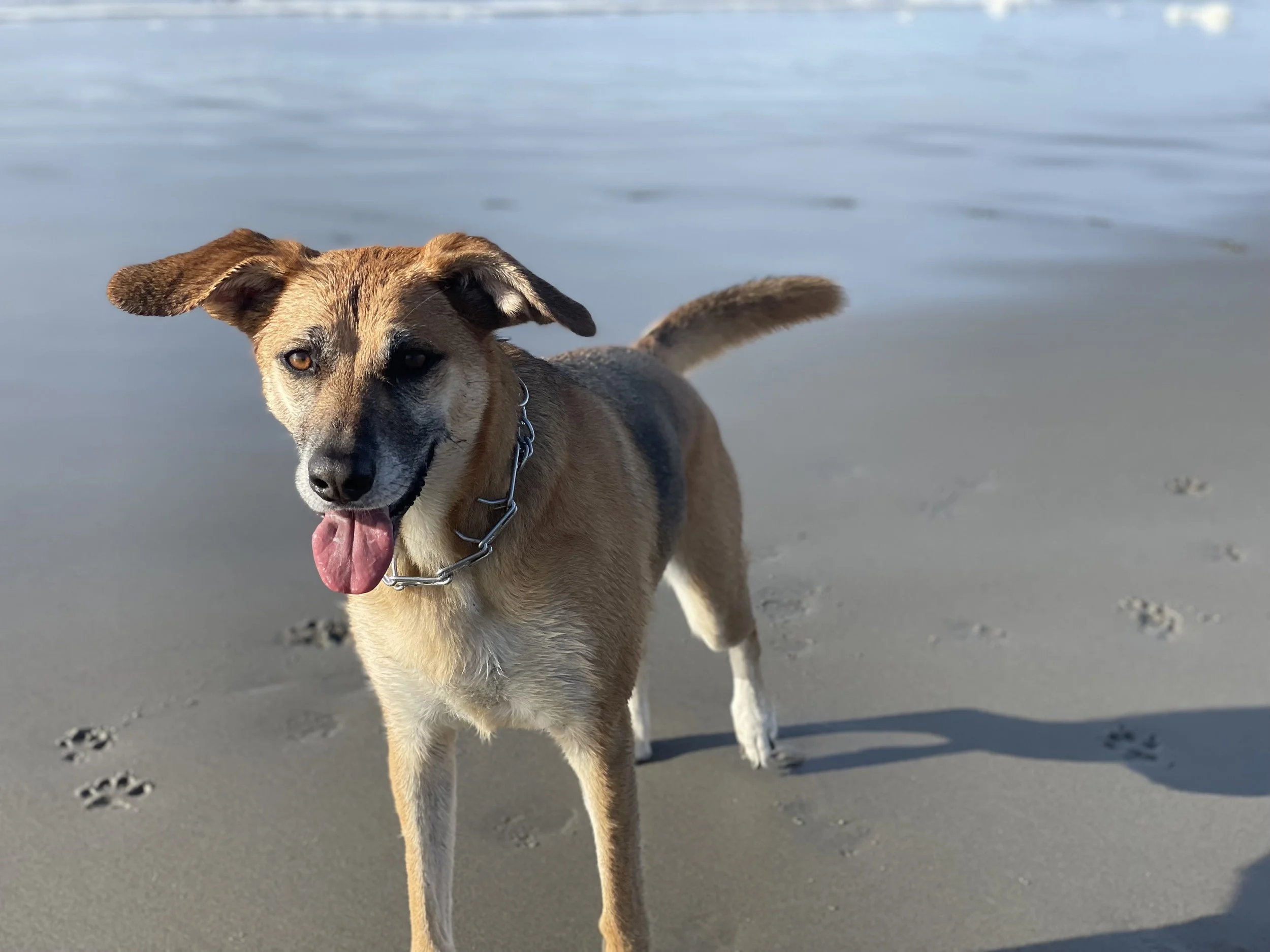
Everything I know about website design I’ve learned from RB Collaborative founder Rachel and, of all places, my dog Aspen!
Somewhere between our early morning walks, evening couch snuggles, and the very serious business of treat distribution, it’s become clear that the principles that make someone a good dog parent aren’t all that different from what makes a website effective. Here are a few of the lessons I’ve learned from the goodest coworker I could ask for:
First Impressions Matter More Than You Think
When my dog meets someone new, there’s an immediate assessment happening. Are you friendly? Trustworthy? Most importantly: do you have anything to give me? Websites work exactly the same way. Visitors form opinions within seconds, and those opinions determine whether they stay or back away, never to return.
For nonprofits and small businesses especially, your website is often the first interaction someone has with your organization. A cluttered layout, confusing navigation, or outdated visuals can unintentionally communicate chaos or neglect, even if your work behind the scenes is incredible. A clean, inviting design sends the opposite message: you’re professional, thoughtful, and worth engaging with.
Let Your Personality Shine
Aspen’s silly. She’s adventurous. She loves her people fiercely. She’s not a quiet, demure dog. She has opinions, and she’s not afraid to let you know about them. And I love her all the more for it.
Take a lesson from Aspen and get more personal on your website! Make it colorful. Include staff pictures and make their bios fun. Incorporate humor into your copy. Let people see who you are and what you stand for. Don’t let “professionalism” stand in the way of cultivating a real relationship with visitors to your website. Remember: people buy from people.
Consistency Builds Trust
Dogs thrive on consistency. My mornings involve coffee and an immediate walk. At 5:30 PM on the dot, Aspen is checking her bowl. She makes sure I don’t stay up past my bedtime. If I deviate from the routine, I hear about it.
If you act unpredictably, you can quickly lose the trust of a dog. And the same principle applies to websites. Consistent colors, fonts, messaging, and tone help visitors feel grounded and confident as they move through your site.
For nonprofits, consistency reinforces credibility and responsibility. For small businesses, it builds brand recognition and reliability. When everything feels cohesive, users don’t have to work hard to understand who you are or what you offer, and that sense of ease goes a long way toward building trust.
Positive Experiences Keep Them Coming Back
Positive experiences build anticipation and loyalty, and websites are no different. Fast load times, accessible design, mobile-friendly layouts, and thoughtful content all contribute to a pleasant user experience.
When people enjoy using your website, they’re more likely to return, share it with others, and engage more deeply with your organization. For nonprofits, that might mean repeat donors or volunteers. For small businesses, it often translates to repeat customers and referrals. A good experience can be the start of a long relationship.
Adapt to Their Needs [Not Yours]
One of the quickest ways to confuse a dog and set everyone up for failure is to ignore their signals and insist on your own agenda. Websites can fall into the same trap when they’re designed around internal preferences rather than user needs. It’s tempting to prioritize what we want to say instead of what visitors actually want to know.
Effective website design starts with understanding what your audience is there for. What questions are they asking? What problems are they trying to solve? Designing with their needs in mind leads to clearer messaging, better structure, and stronger outcomes. When users feel understood, they’re far more likely to engage and take action.
Reward Good Behavior
Dogs repeat behaviors that are rewarded, and website visitors do the same. They’re not as good as treats and belly rubs, but when someone takes an action — signing up for a newsletter, making a donation, submitting a contact form — it’s important to acknowledge and appreciate that effort.
Thoughtful thank-you pages, confirmation messages, and follow-up emails reinforce that positive interaction and encourage future engagement. These small moments of recognition can make a big difference.
My dog probably thinks she’s just very good at being adorable, but she’s also a daily reminder that trust, clarity, and empathy are powerful tools. When we approach design with the same care and attentiveness we give our four-legged friends, we create websites that people actually enjoy spending time with. And in the end, that’s what keeps them coming back — tail wag optional.